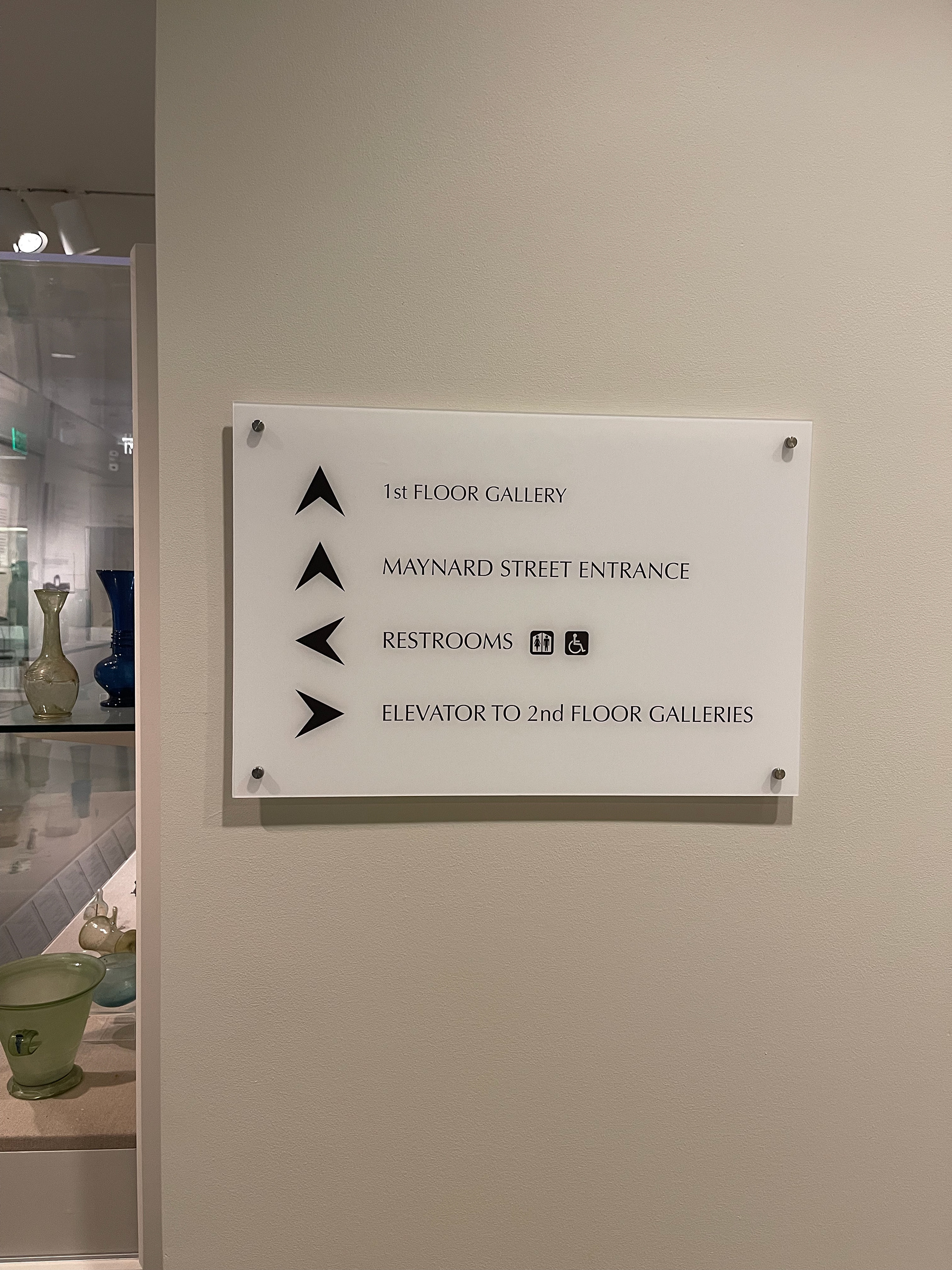
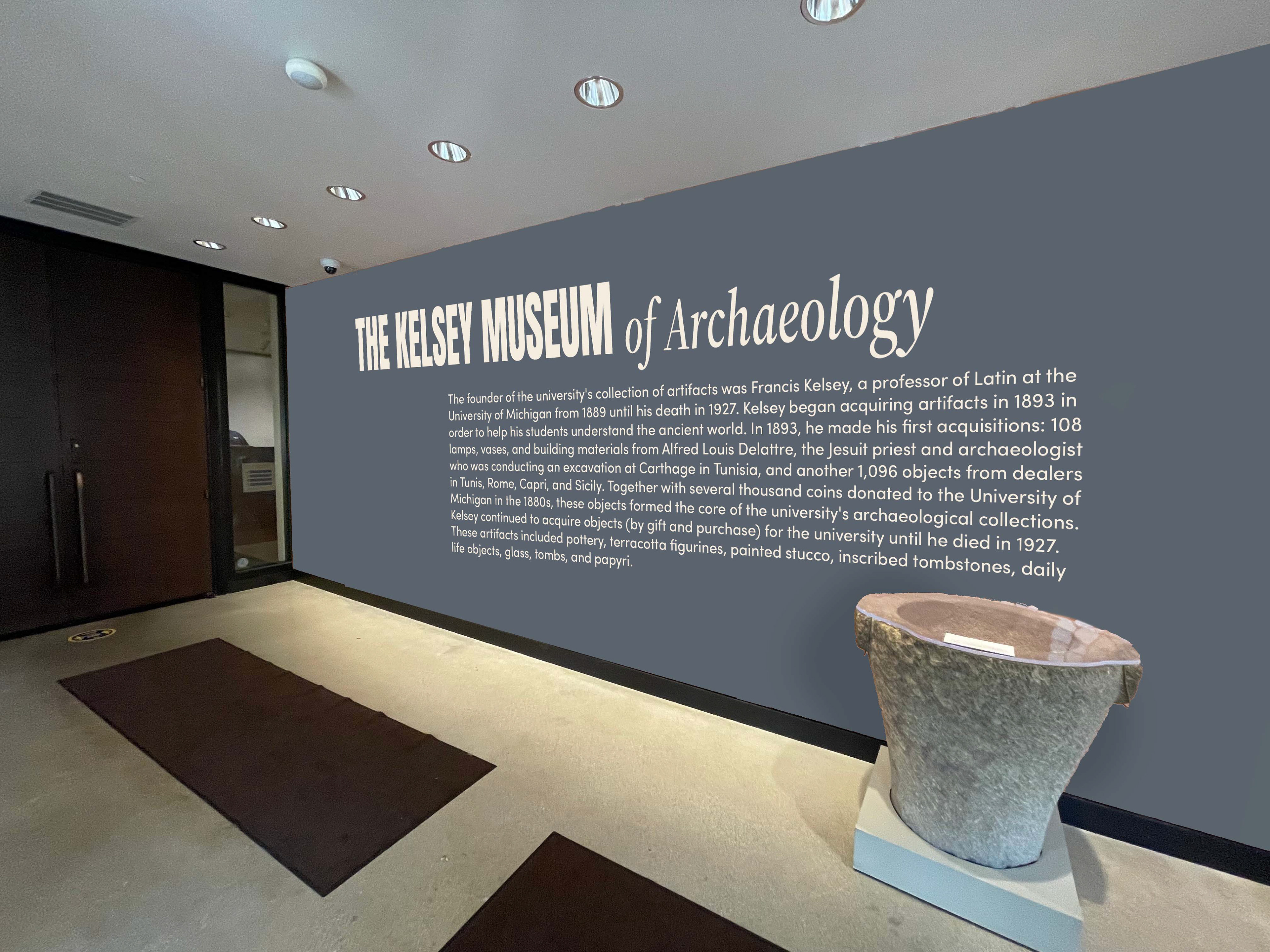
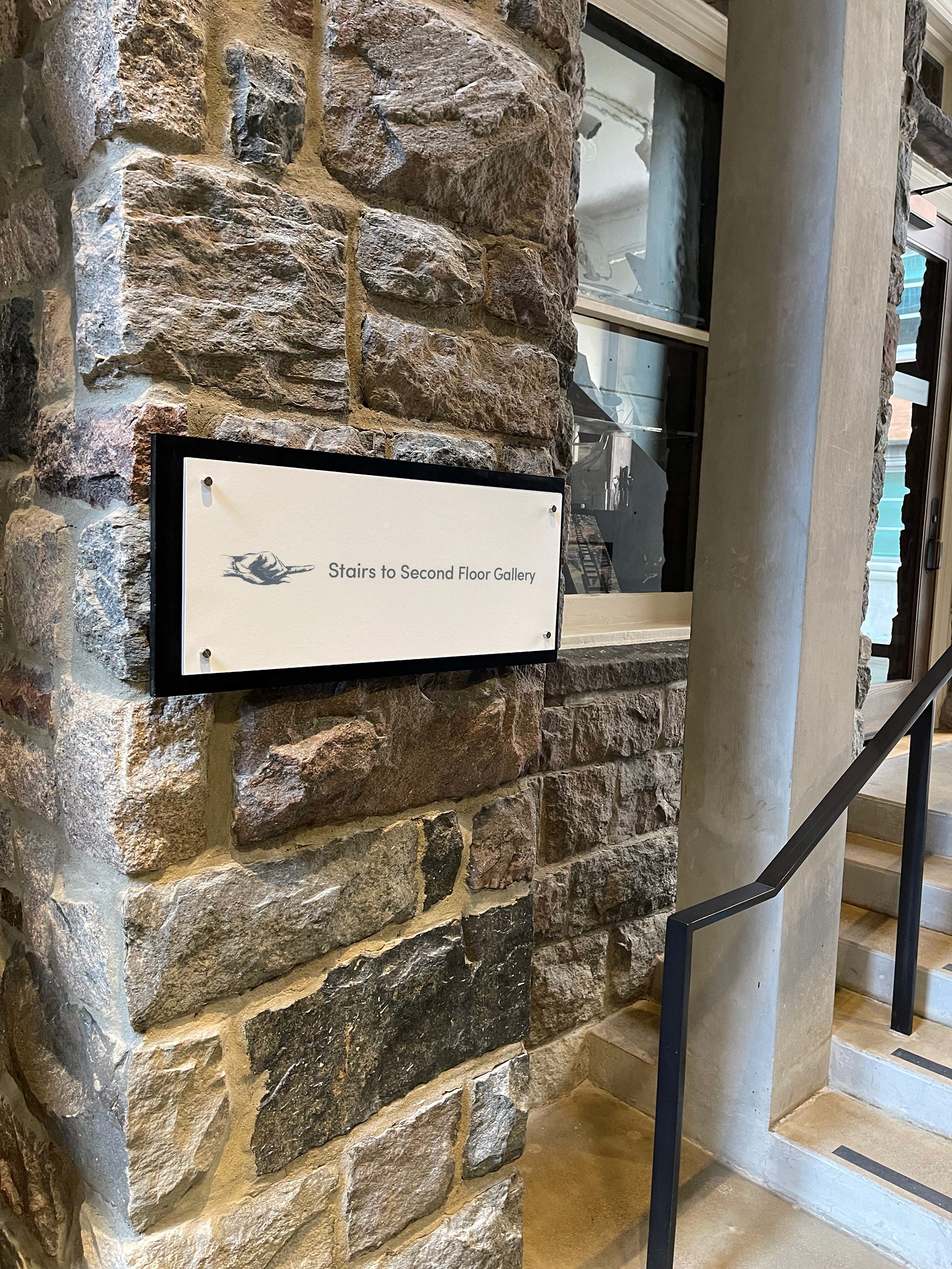
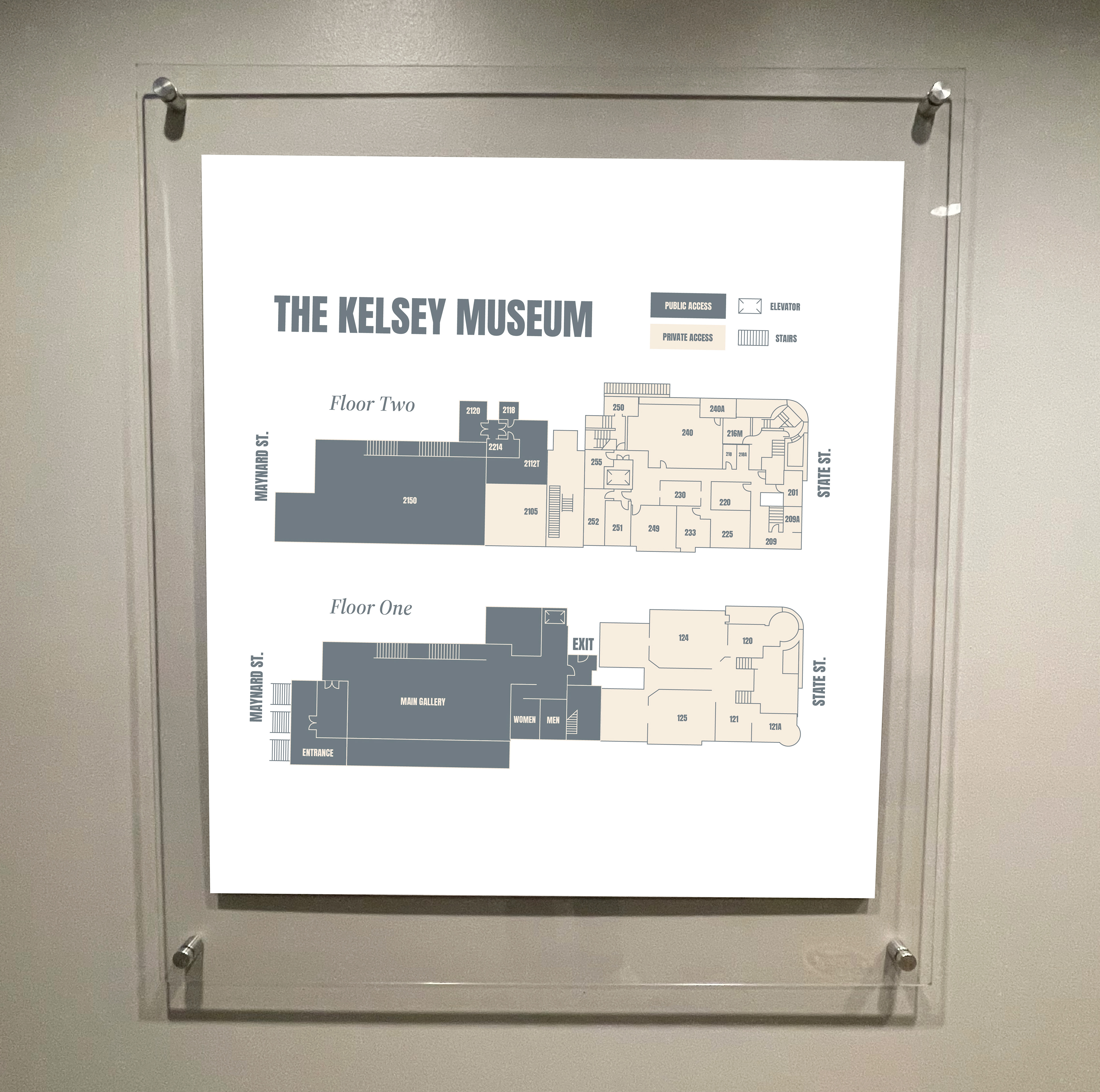
The typography was crucial to this exploration, as Museums demand a significant amount of both directional and informational signage.
I carefully curated typefaces that were accessible, readable and elegant.
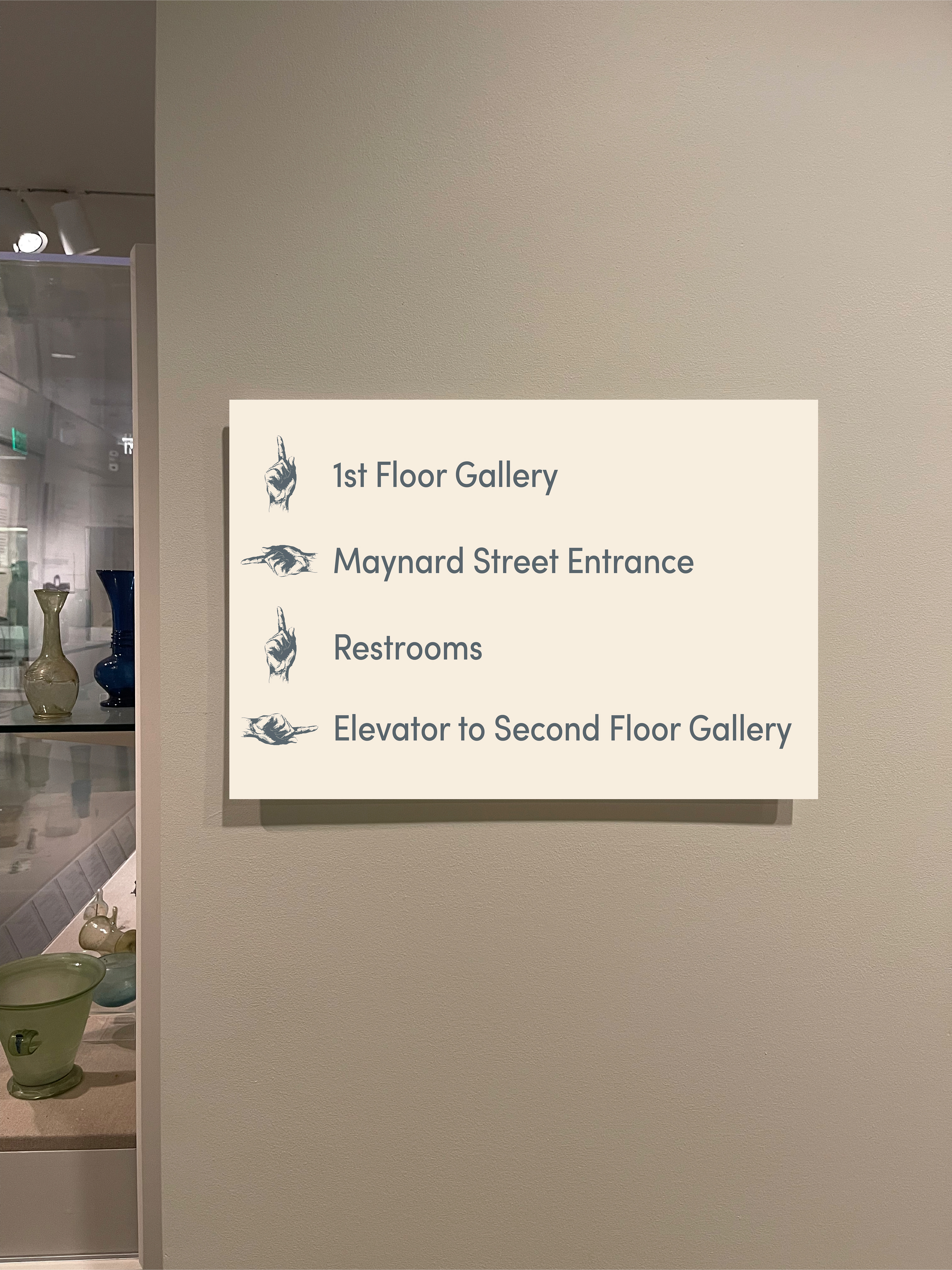
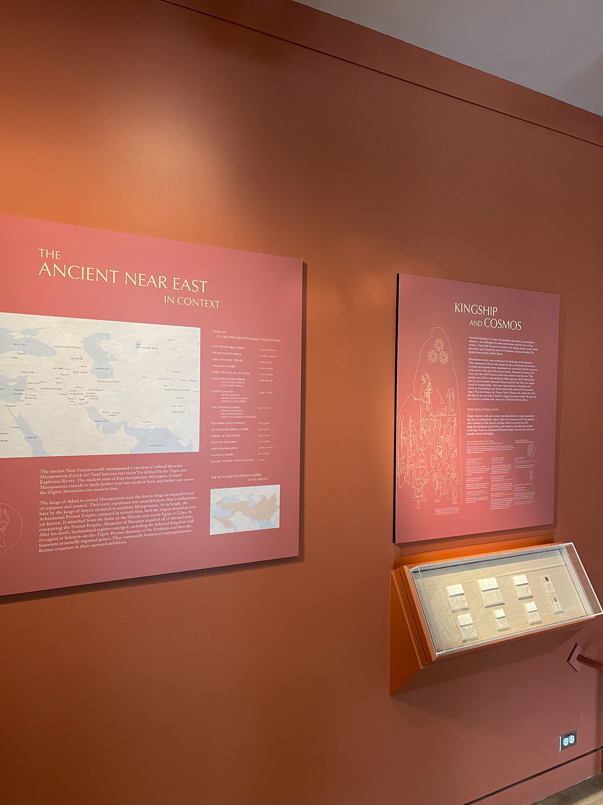
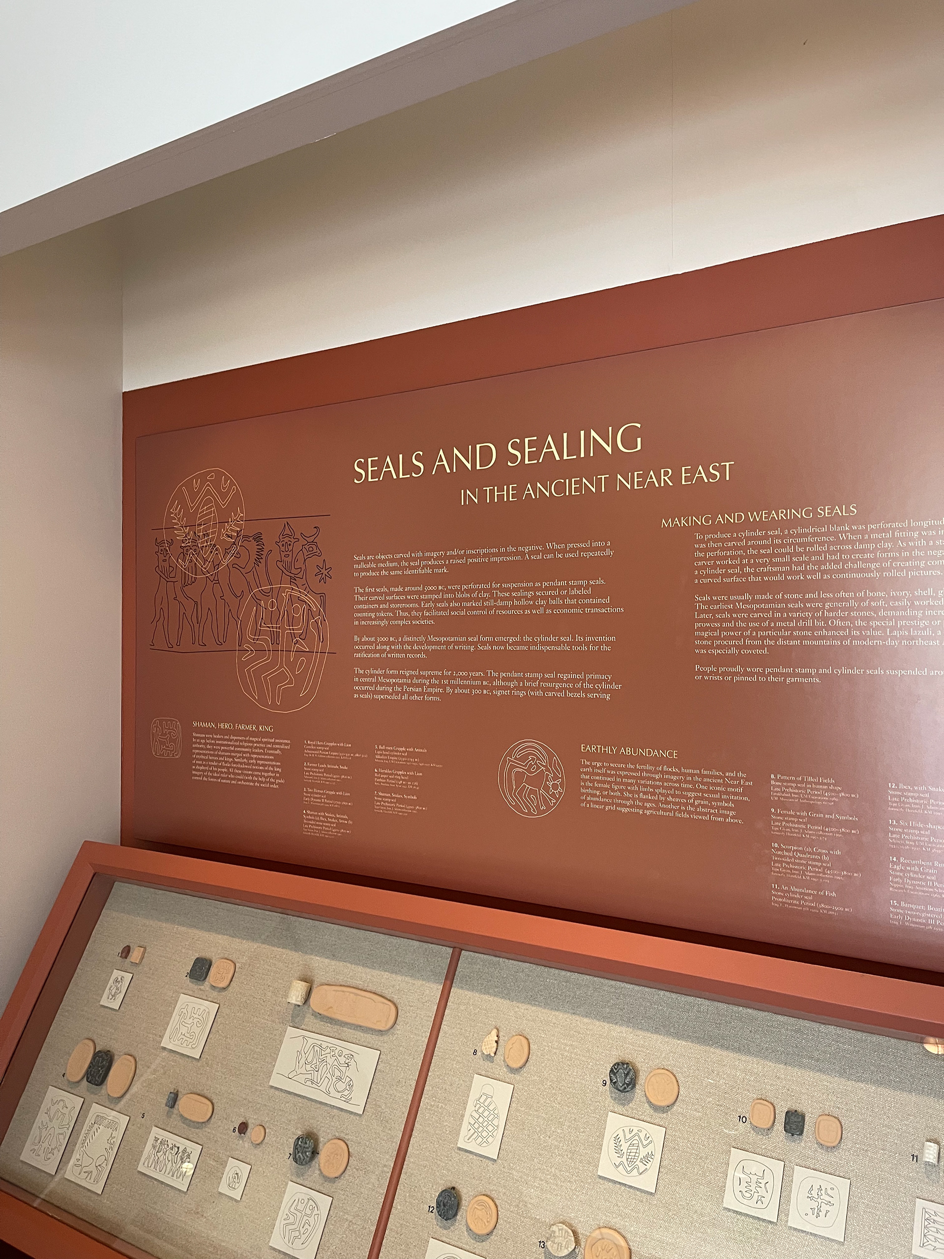
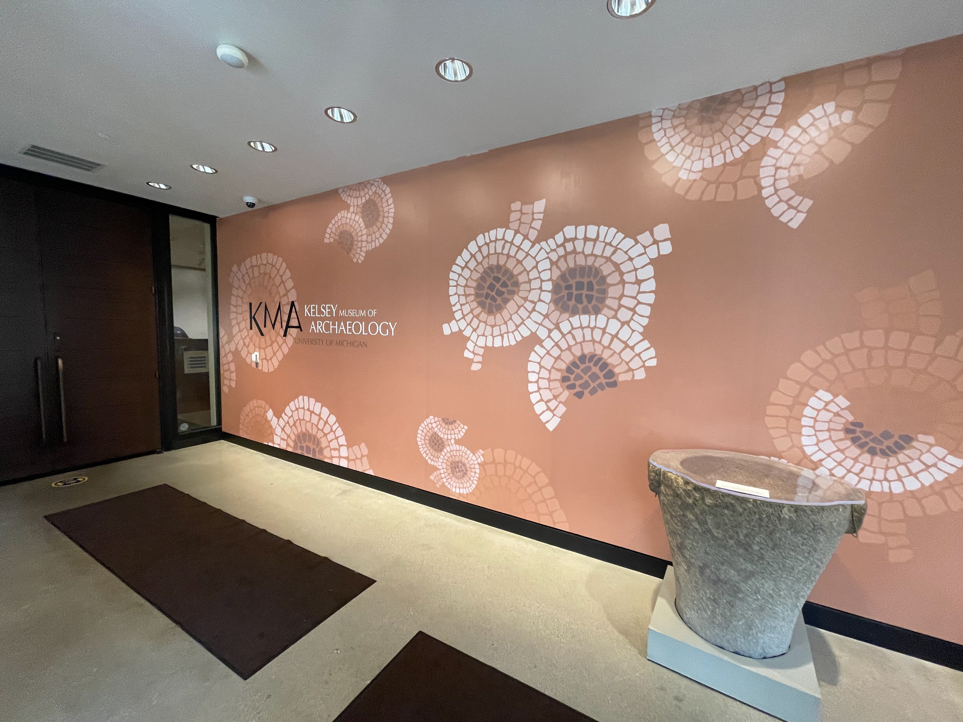
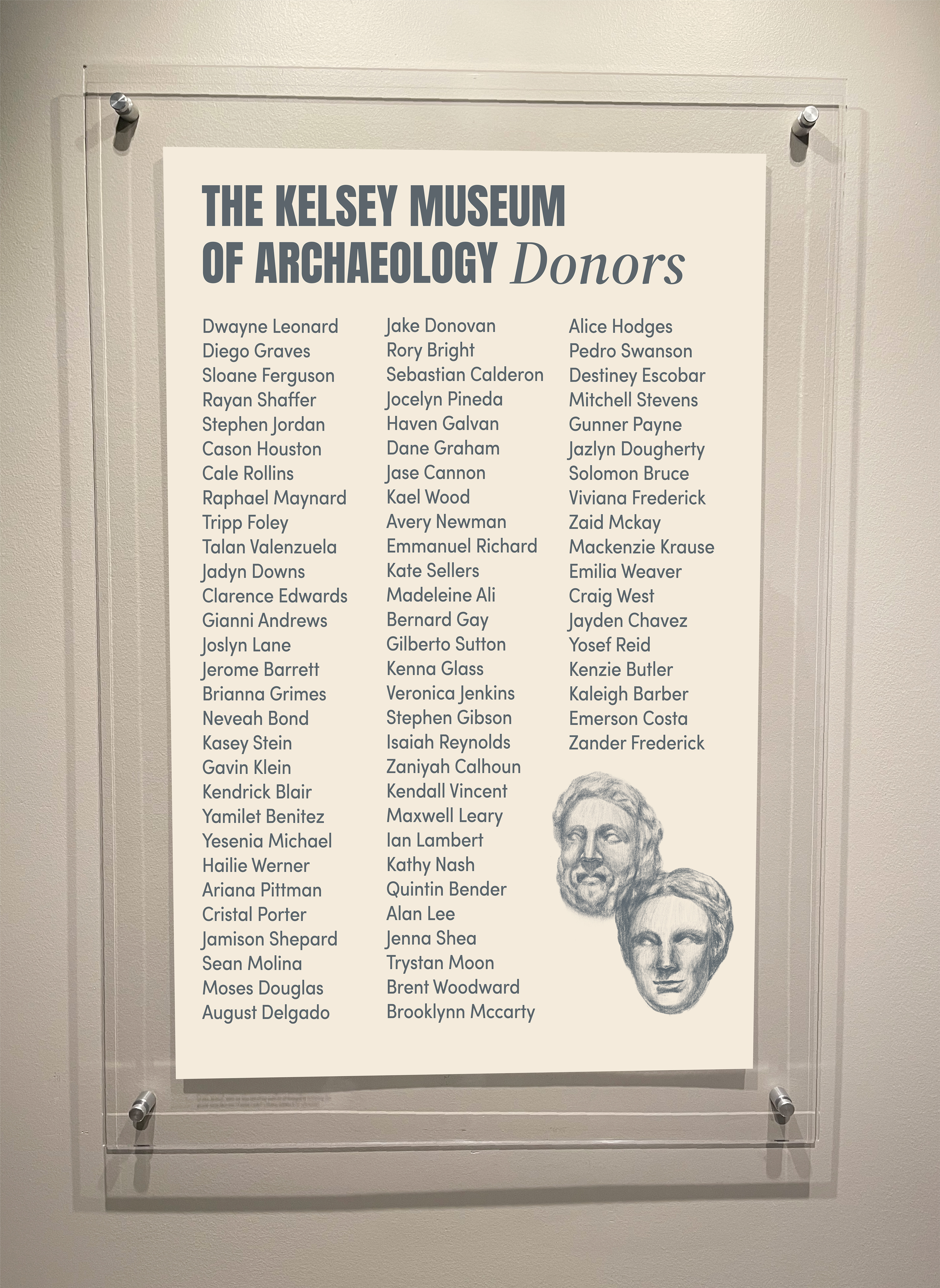
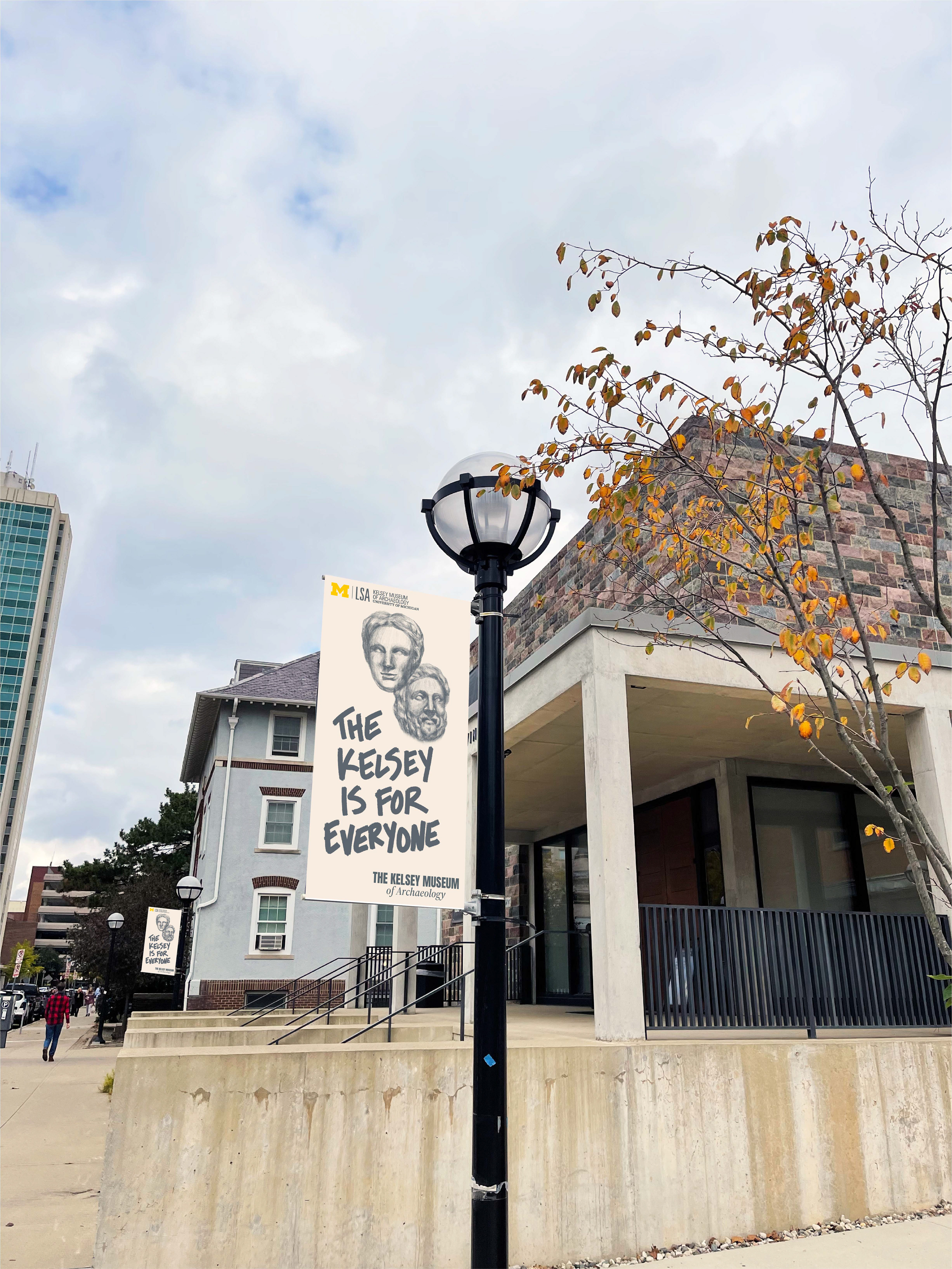
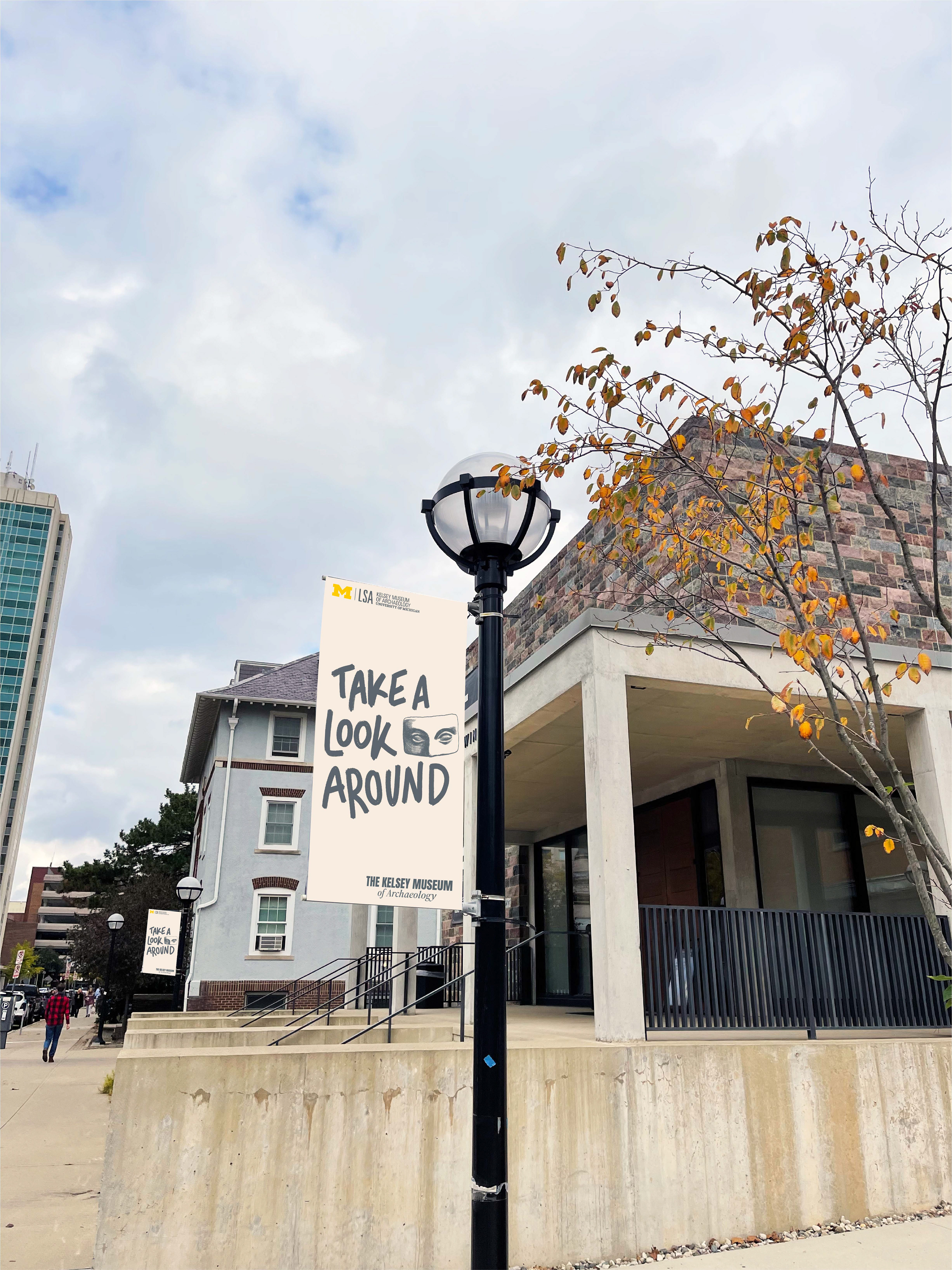
The simple, two-color system was selected to reflect the quiet elegance of the museum while complimenting the classic and historical content within.
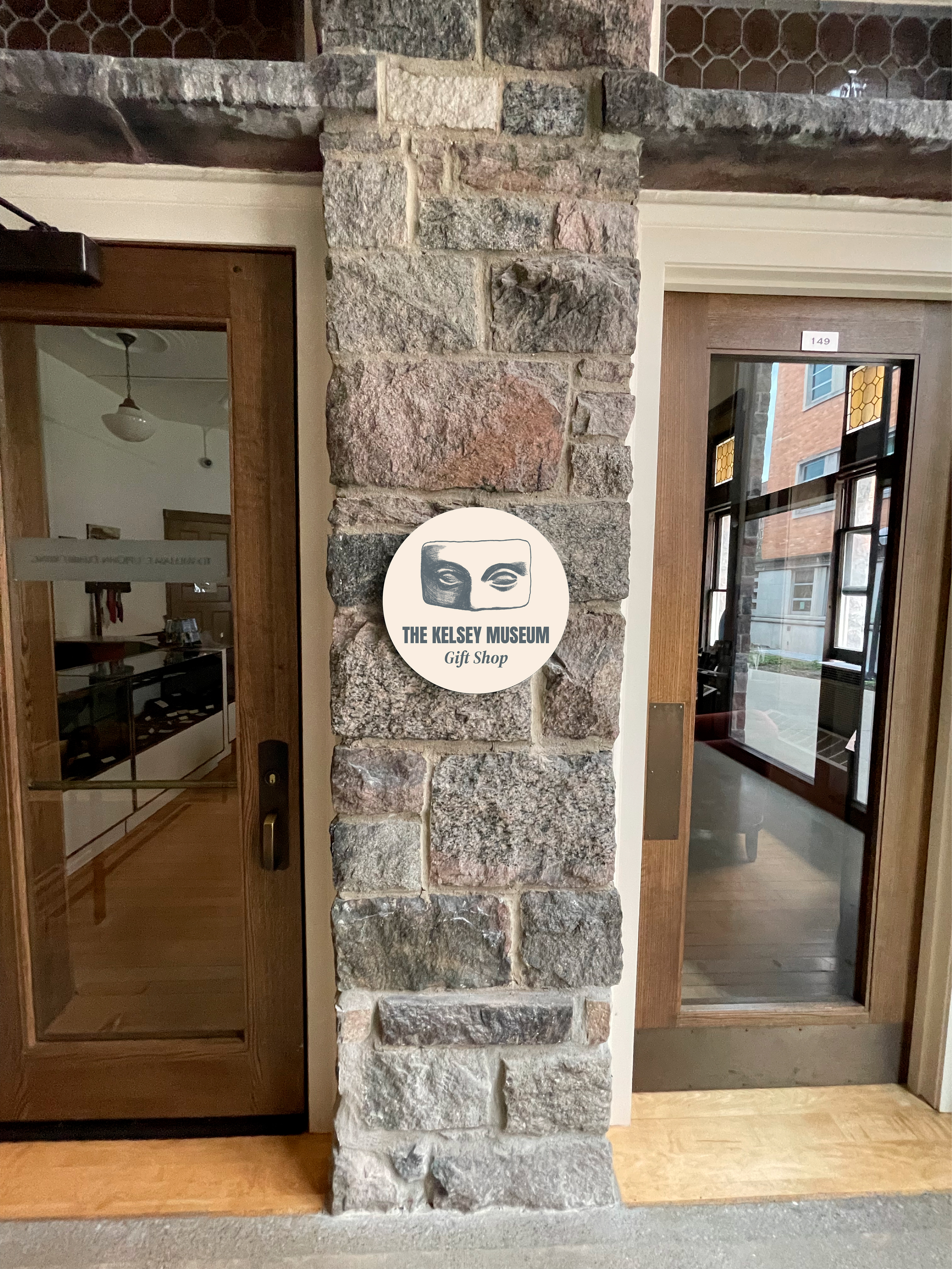
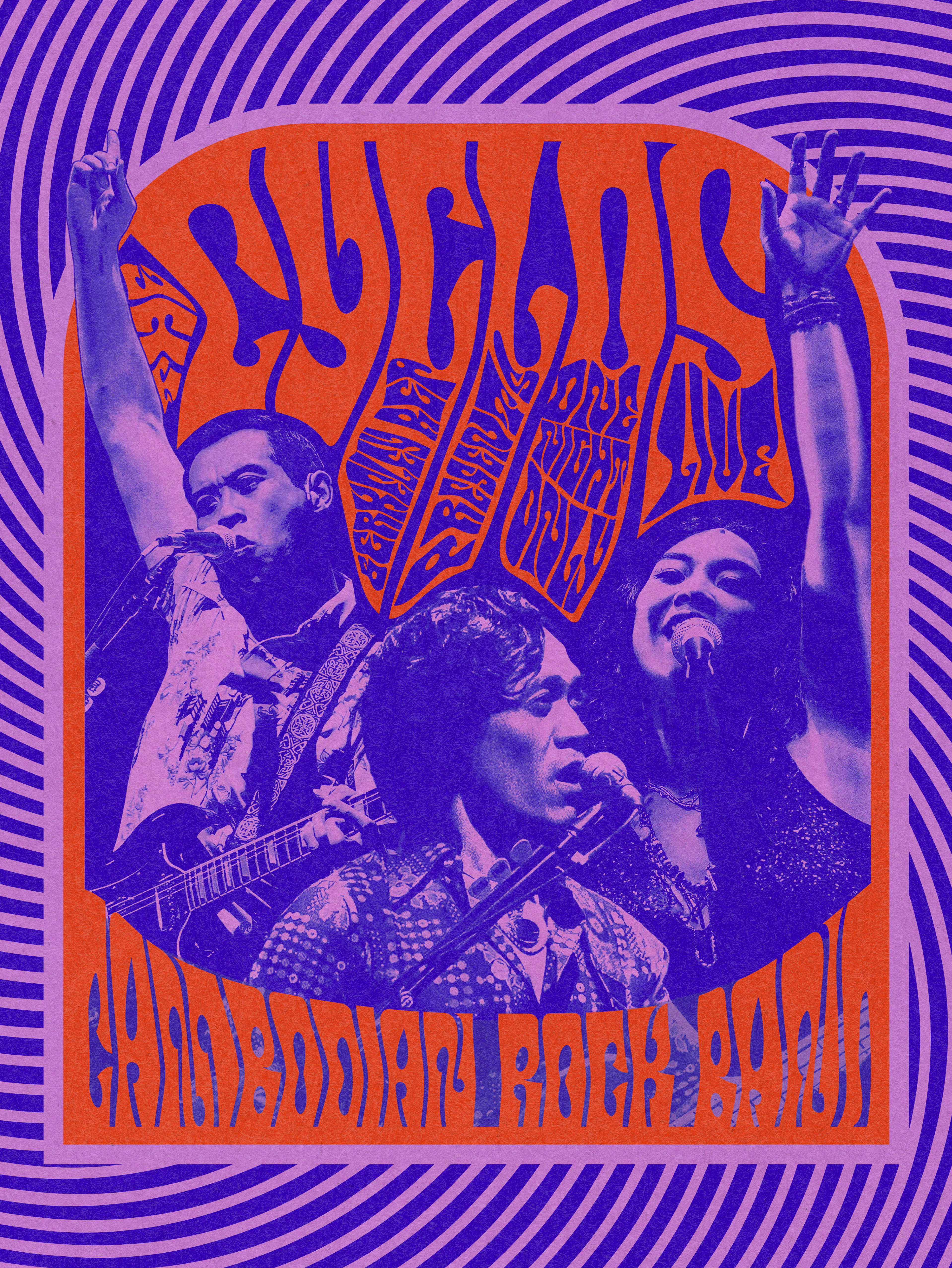
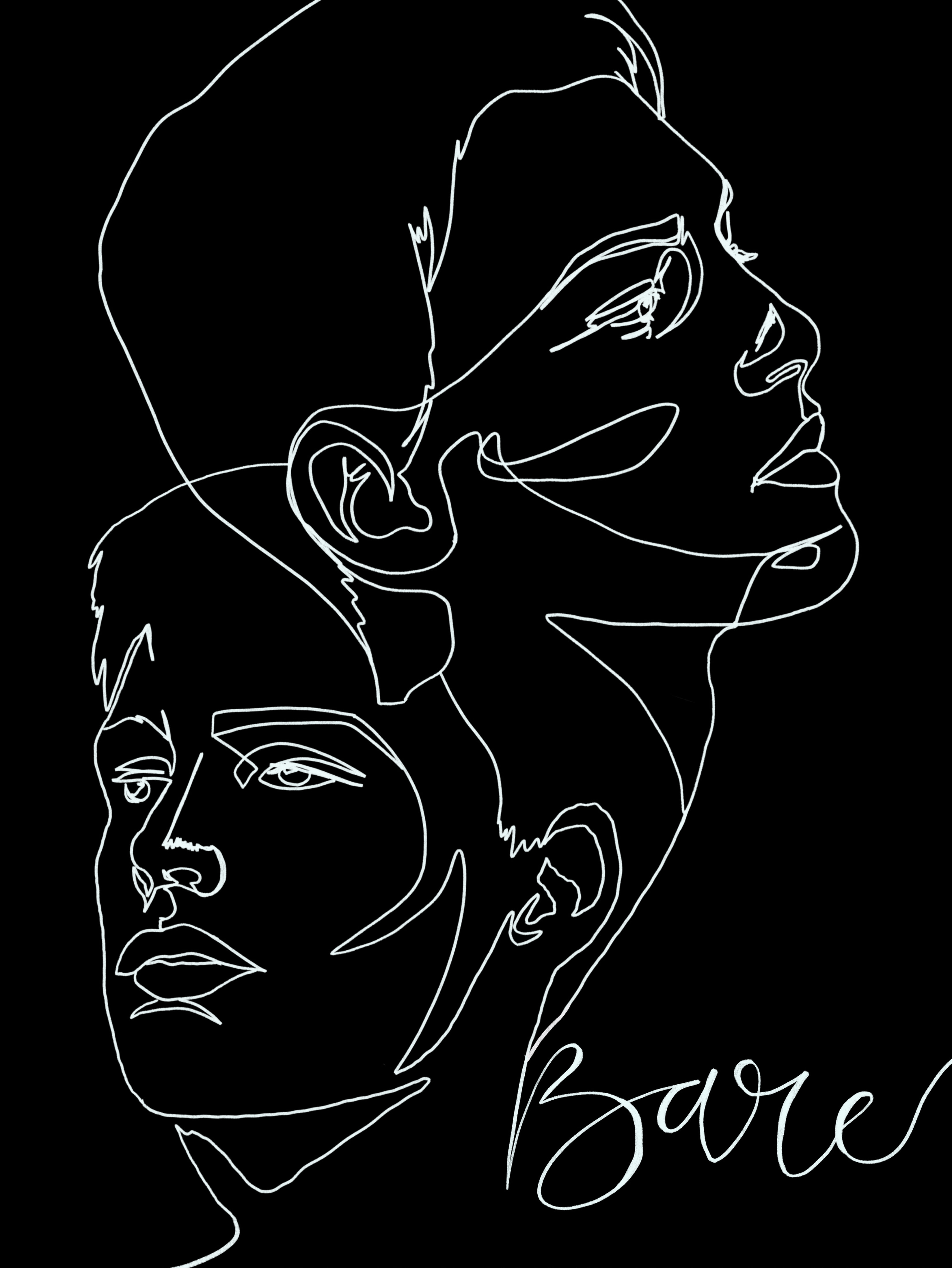
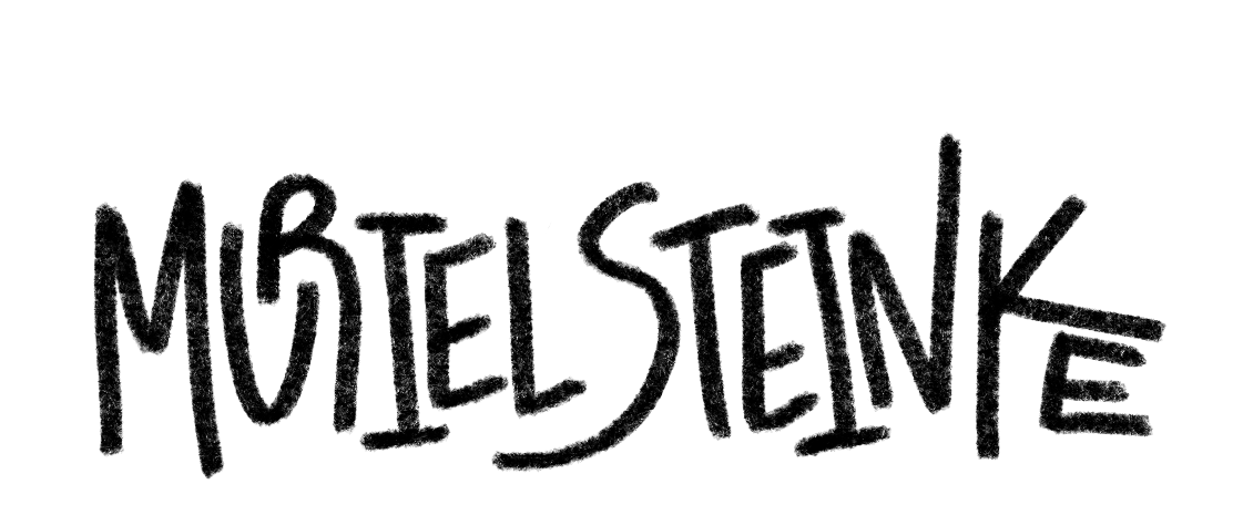
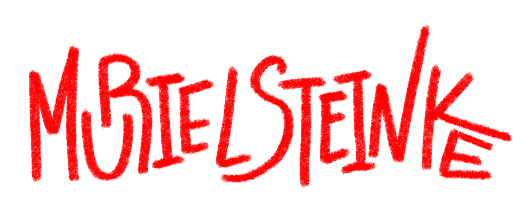
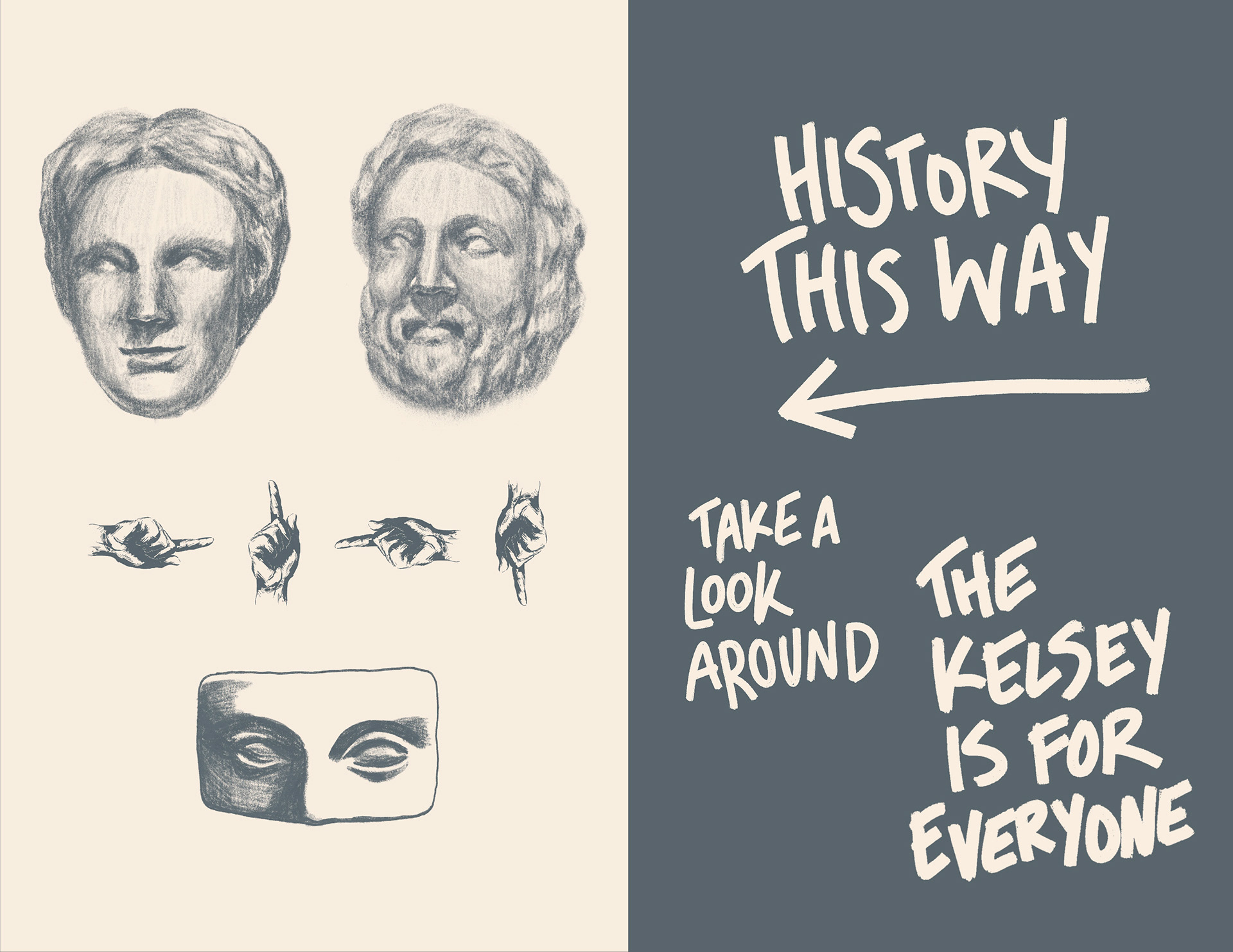
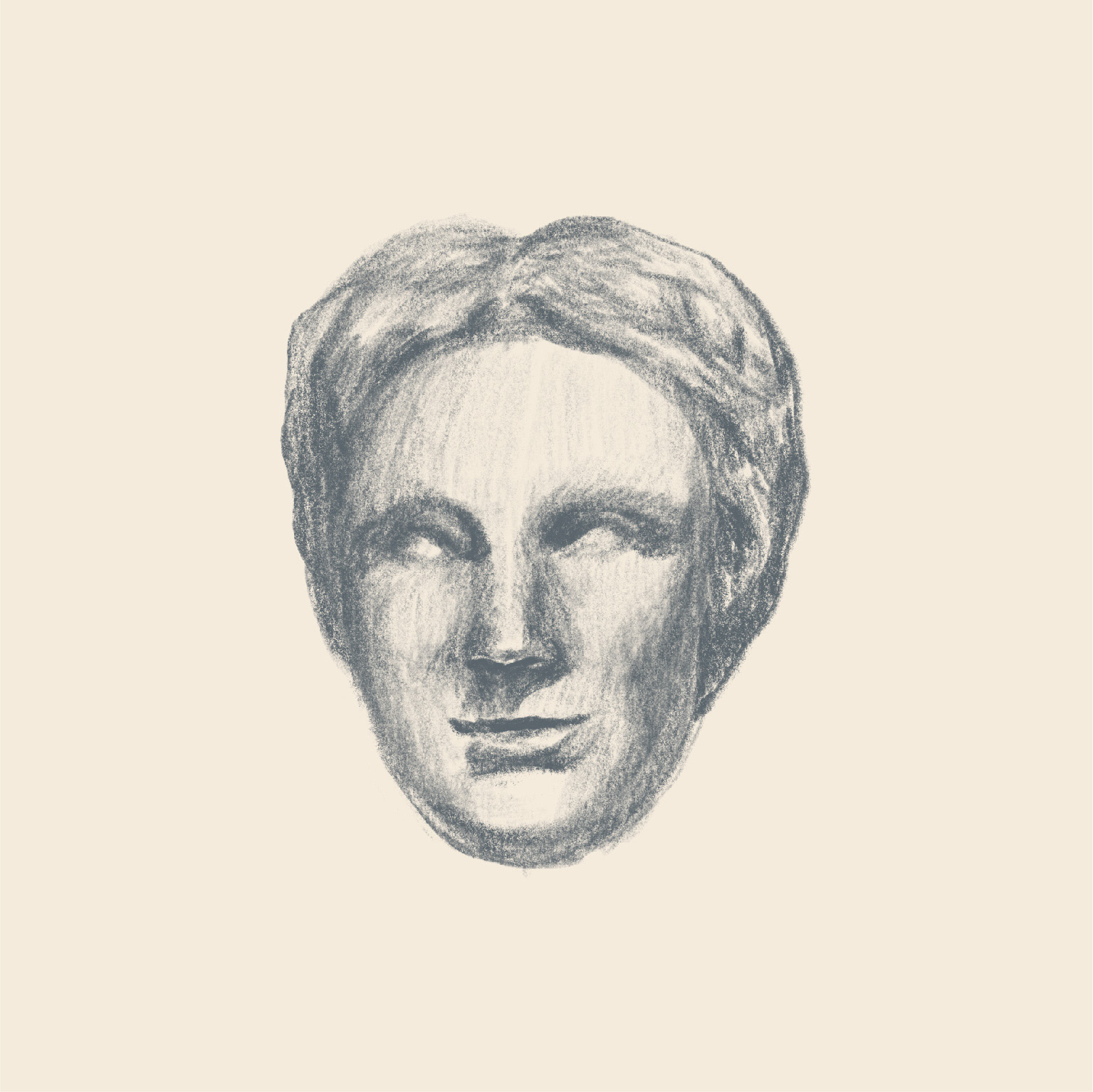
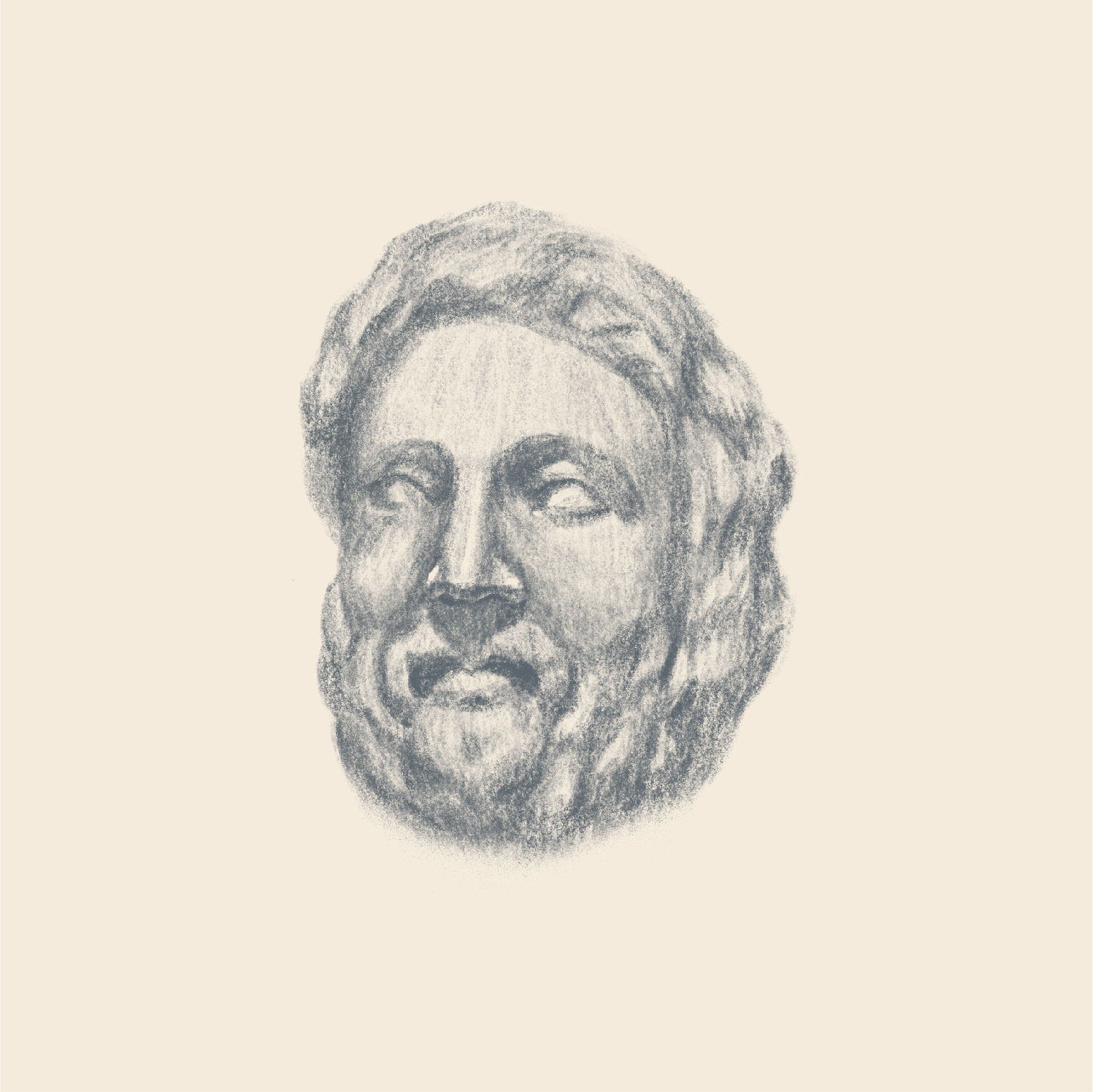
A tribute to the rich visual collection on display at the Kelsey, I illustrated some of the artifacts to accompany various signage. In addition to the illustrations, I encorporated hand-drawn text (to be used sparingly in promotional materials) to emphasize the accessibility of the museum.
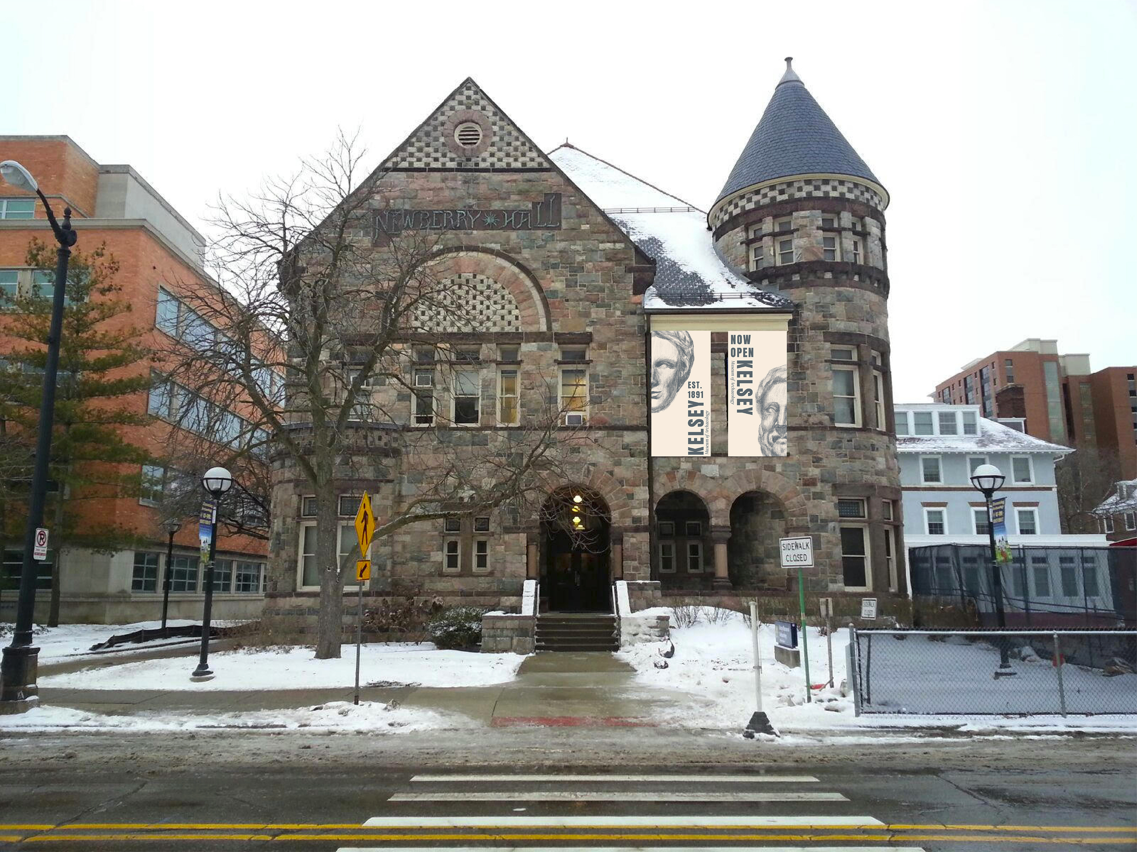
I wanted to bring the inside of the museum to the outside to give passerbys an idea of what is waiting for them inside the Kelsey.
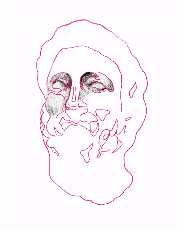
A closer look at process...
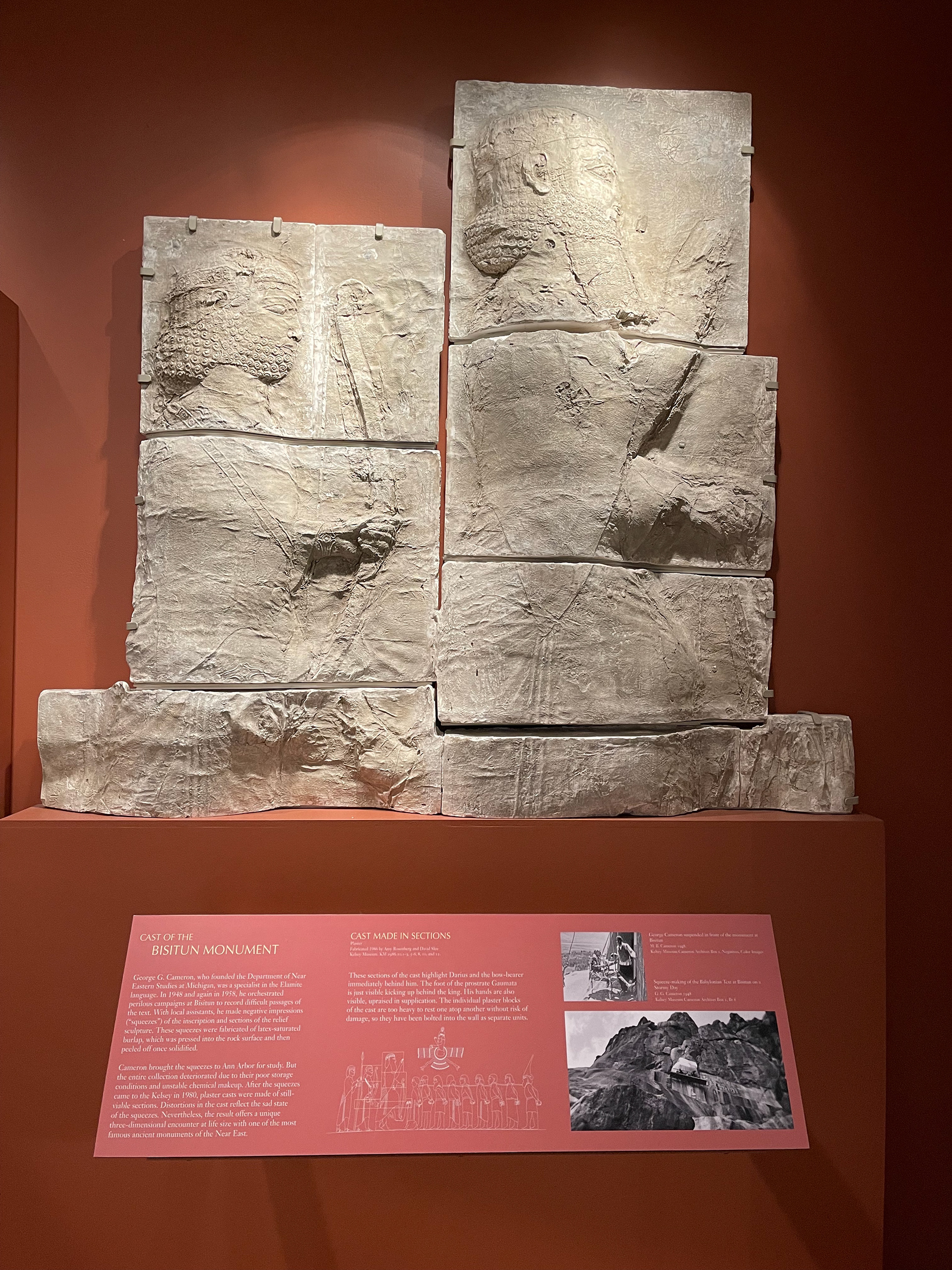
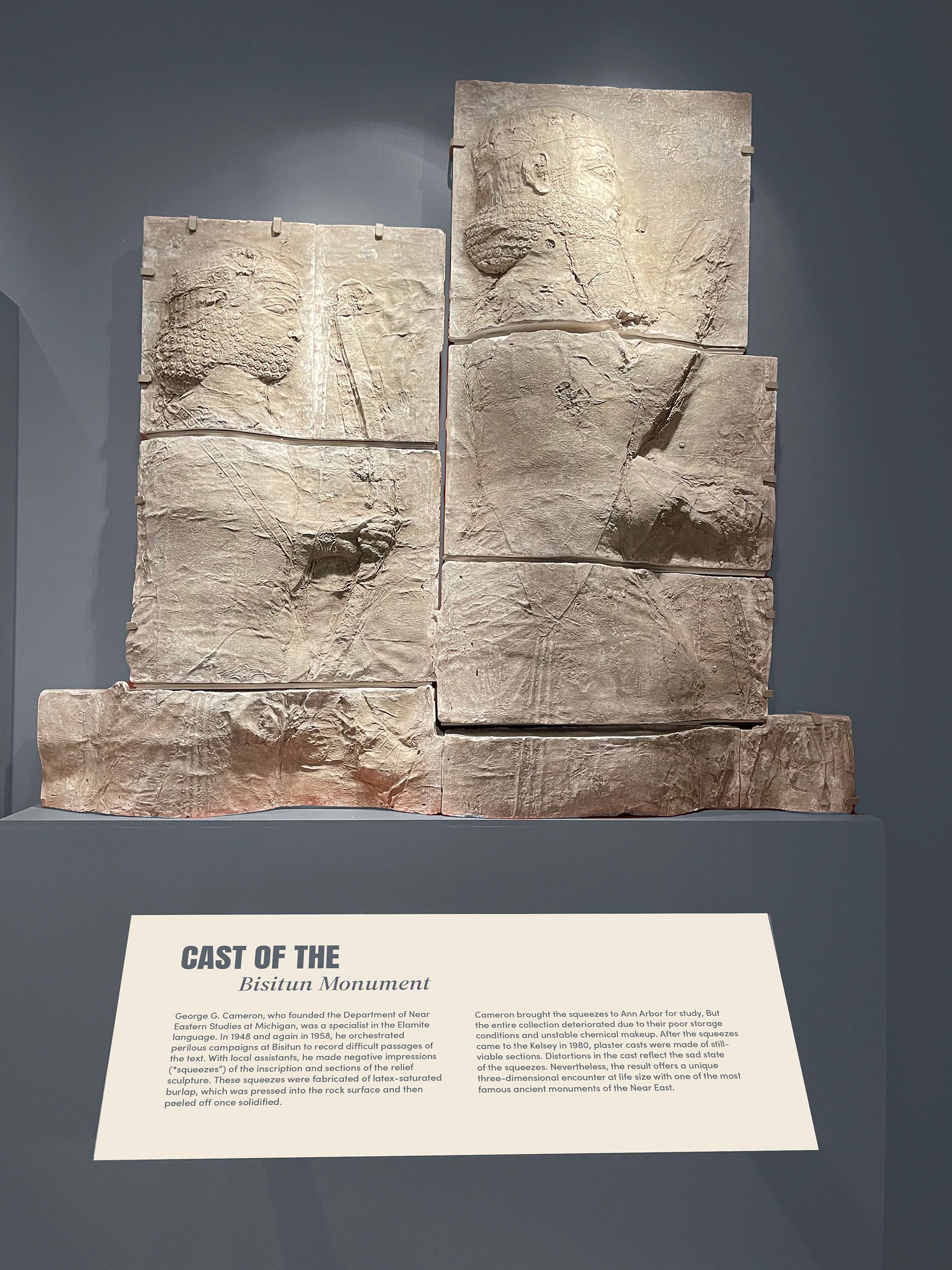
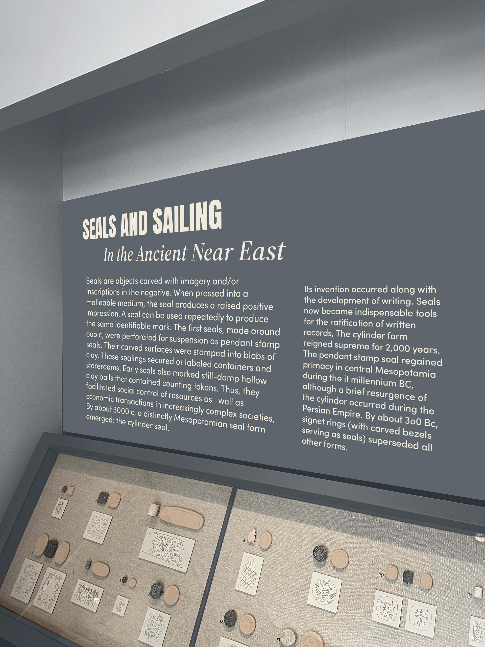
The Kelsey Museum prior to its reimagining: